Saturday, February 20, 2010

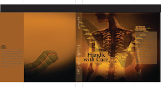
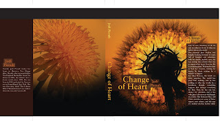
Final Book Covers


Concept Statement Revised:

Transformed Hope

Transform - to change in form, appearance, or structure; metamorphose.
to change in condition, nature, or character; convert.
-- alter, metamorphose, renew, mold, change, switch, transfer, overcome, prevail, sway

Hope - the feelings that what is wanted can be had or that events will turn out for the best, a particular instance of this feelings; a person or a thing in which expectations are centered: The medicine was her last hope
-- desire, believe, trust, anticipation, aspiration, faith, goal, gain, security, stock, life, wish, optimism, prospect, promise


To Suggest:

to suggest that love is complex
to suggest that hope can survive in even the most dire of situations
to suggest that the weak can become strong
to suggest that life can be intense
to suggest that fear can be conquered
to suggest that secrets are kept 'til the end


Bruce Mau

He is the Chief Creative Editor of Bruce Mau Design. He founded the studio in 1985. He also founded a studio-based postgraduate program that helps refocus and teach for the future of design. He designed the Zone Books. They were covers for a complex combination of critical thinking about urbanism by philosophers. The books also featured graphic elements that gave the tone for the books. His method of creating the cover was really about modeling a city and creating a map.

38. Explore the other edge.
Great liberty exists when we avoid trying to run with the technological pack. We can’t find the leading edge because it’s trampled underfoot. Try using old-tech equipment made obsolete by an economic cycle but still rich with potential.

I chose this because I feel sometimes that I am too limited by the computer or technology I am comfortable with. I would like to branch out and try new things and different ways of doing them.

Monday, February 15, 2010

Gathering Ideas

Photography and type has always given me issues. I like them separate but when combined, I feel one makes the other look unnecessary. I found this sweet website while looking for great book cover designs. It has everything from vector to photography to type only. They are beautiful.

Sunday, February 14, 2010

20 Rules

This PDF included 20 rules on what consists of great design and how to create great design. It included everything from type to images, to measuring with your eyes.

3 Most Important:
Be Decisive - Everything in the design should be placed there for a reason. If it is just random or an afterthought, the cohesiveness of the design could break down.
Pick Colors on Purpose - Colors have meaning tied to them, they evoke certain emotions or conjure up certain images. A great color scheme can relate a certain message even before the design registers in the viewer's mind.
1,2 Punch - This has to do with hierarchy and moving the eye throughout the design. If there is no movement, there is static. Boring.

3 Things I need to Practice:
Negative Space - I always try to fill the space and don't leave much balance with negative space. I am even having this issue with my book covers. I find it hard to create white space with images without seeming to frame the objects within the piece. I need to practice the flow of negative to positive space.
Type as Image - Regular schooling teaches you that type is informative and nothing more. Now, we are taught that it has form, space, and meaning. I need to practice really using my type as a dynamic design object in my art.
One Visual Voice - I am ok at this in one piece, but when I design a series I find this is really hard to do without making everything look the exact same.

3 Things I ignore
Be Universal - There are times when I will design something that I think everyone and their mom should understand, but many times designers are designing for a certain demographic. As long as you know they will get it, then I think you are fine. Trying too hard to get everyone to understand will muddle the message or make it too simple.
Create Images, Don't Scavenge - Maybe when I am out of school I will try to follow this more closely, but the heavy amount of hw and work we are expected to do leaves us little choice in where we can get our images. If the internet works, use it.
Type is Only Type When Friendly - Legibility is important, but sometimes type can be used as texture or image. This is when actual legibility might take away the purpose of the type.

Saturday, February 6, 2010

Chip Kidd & John Gall

Chip Kidd
Born in Reading, Pennsylvania, Kidd grew up in the Reading suburb of Shillington, strongly influenced by American popular culture.Kidd is currently associate art director at Knopf, an imprint of Random House. He first joined the Knopf design team in 1986, when he was hired as a junior assistant. Turning out jacket designs at an average of 75 a year. Publishers Weekly described his book jackets as "creepy, striking, sly, smart, unpredictable covers that make readers appreciate books as objects of art as well as literature." USA Today also called him "the closest thing to a rock star" in graphic design today, while author James Ellroy has called him “the world’s greatest book-jacket designer.His book jacket designs for Alfred A. Knopf (where he is associate art director) have helped spawn a revolution in the art of American book packaging. His work has been featured inVanity Fair, Eye, Print, Entertainment Weekly, The New Republic, Time, Graphis, New York, andID magazines, and he is a regular contributor of visual commentary to the Op-Ed page of The New York Times.

John Gall
Born in 1963 in New Jersey and a graduate of the design department at Rutgers University, Gall brought along his own original and idiosyncratic design sense—and most especially literary intelligence. Recently, in addition to Vintage, Gall assumed the helm of another venerable imprint, Anchor Books, the oldest trade paperback publisher in America, founded in 1953 by Jason Epstein.Gall’s stylish sensibility, simple but elegant use of typography and quietly rebellious spirit infuse these literary works with an added dimension. Subtle and compelling, his covers play with the perceptions of the viewer in unexpected ways, and to satisfying effect. Scanning the table of trade paperbacks at the local bookseller, one would have no difficulty spotting Gall’s distinctive and visually articulate work. Collage, photography, typography and art are all grist for the mill, yet no matter how varied the medium, the end result is pure Gall.

These two book designers really try to understand the voice of the work that they are making the cover for. They really try to capture the essence of the work. Each design is revolutionary. John Gall tries to give each of his book covers a surprise twist that somehow capture the idea of the book.