Tuesday, March 30, 2010

Journal 9

Motion Videos:

Saul Bass Motion
Without Sound - The movements flow with regard to gravity. I feel like they have good start up and stopping speed that you would see with gravity and external forces. I really payed attention to the way the motion moves rather than timing with sound. It helps see the fluidity of the objects.
With Sound - With sound you get an entirely different feel. The big brass band playing really made me feel like I was watching an older tv show. The sequences seemed more like watching I Dream of Jeanne. The hand took on the appeal of Thing in the Adams Family.

Six Youtube Videos

W/O sound - The movements of the type seem jerky at times. Also, the legibility wasn't that fantastic, but I don't think it was about the words, it was about what the words did. The word "vibe" shook giving the feeling of vibrate. I think the city had the words "Bustle" moving up and down. The movements of the type gave you a sense of what the word itself describes. The images and graphics usually just popped onto the screen and the type grew from them. Sometimes it work, but others it seemed awkward. It was good from the body, but not so much the record.
With sound - The sound gives it a metro city feel. The droplet fits well with the beat, but the "Let's take a hit" doesn't fit with the type on the screen. I honestly liked it without music better. I liked determining my own feel of the motion. The music just decides it for you. The color is mostly black, but when the trumpet gets more upbeat, more colors are thrown in. These go with the music's feel. Yellows, blues, and reds. Transitions are mostly following a line of type until it can begin a new sequence of type.

W/O Sound - I can easily read the speech with just the type and I know what's going on. It is also easy to tell which words Dane Cook is yelling about because the color gets more vibrant and the text gets HUGE. The words also take the form of what he his talking about. Driveway turns into a driveway and so forth
With sound - The laughs actually go with how many laughs start with. I love the fading of the text. The timing is so great on this and the way the type layers is spectacular. The colors are mostly yellow and white with pink for laughter. It really is just for contrast instead of emphasis. The transitions come with laughter and disappearing of the text. The text never really leads you to a new section of the speech.

W/O sound - the first thing I noticed was the speed. It was all pretty fast and hard to see emphasis due to stopped or slow words. I could barely read some of it. The way the type transformed or lead into other type was nicely done. I liked the background and the yellow, blue, and gray. These changed the color of the background to vary the video up a bit.
With Sound - Woah there is a creepy low voice guy reading this. The speed of the type really doesn't match his cadence of the voice. He seems to have a slow drawl and the type was flying by with undue emphasis.

W/O sound - the type starts out huge!!! and pretty much stays huge. The big words are hard to read because the type was sped up to fit it all. It was very blurry. The fight between the two characters was noticeable by type color, actually words, and location of how they flew to the back and edges of the screen
With Sound - So, the who big words thing...they aren't shouting until about the middle of the video. Also, grammar...it's wabbit season...not its wabbit season. Dumb. The only part of the speech that really is neat is the fight and how the fire explodes at the end. I do not care for this one that much.

W/O sound - The movements of the type were kind of like frame by frame cinematography. It was very jerky, but I will have to wait for the sound to see if that fits in with the sound. It was really hard to tell what I was supposed to read first because the later type never really faded out for a bit so type just kept piling on without clear hierarchy. Transitions are just white flashes on the screen, but it works with the choppy way the type moves.
With Sound - I never expected a country song. The choppy motion of the words doesn't go with the fluidity of the singer's voice. It is actually really distracting. The chorus is pretty sweet. The typography is formed well and looks fantastic. I would make the type slide like in the Saul Bass Motion piece. His was fluid and ran with a speaker. It wasn't halting.

6. Flight of the Conchords - If You're Into It - Type in Motion
Without sound - what makes this video the most unique is that it starts off like a real book. The pages turn and the words fly off the page to make a blank slate for the next page. Sometimes the words were replaced by graphics, and the type created really neat looking layouts and combinations. The words also multiplied even if the speaker doesn't repeat them thousands of times it helps the viewer understand the meaning behind his words.
With Sound - Guitar! and birds? The placement of the words really fits with when the speaker pauses and his fluidity. The type also changes for which singer is singing. The nice soft singer is a thin, serif font. The deeper voice is all caps, bold, sans serif. The closing of the book really goes with the end of the music. I think this is my favorite because the type does more than just write what the singer says, it also gives character to each voice and connotations.

3 Movie Title Sequences

1. Catch Me If You Can
Fantastic. I have always enjoyed this title sequence. The graphics, lines, and colors all perfectly represent the time and feeling of the film. It gives you a sense of drama. The cat and mouse game that takes place during the movie is well thought out in the title. The characters conflicting attitudes and roles is also evident. Scale changes in the beginning show how the main characters are equally above the "normal" people. Then, near the end they become smaller and about the same size. They are taken down a notch in society and more even with each other.

2. Panic Room
They were the first (really) to put type into a city scape and make it look like it was just part of the environment...then of course Heroes did it several years later. It has become popular in other movies also, but Panic Room really makes it legible without making you read everything head on. The type also sometimes is like a hide-and-seek game. The music also sets the scene for showing the danger of what's about to come. The metallic sheen of the letters could also relate to the metal room the main characters will spend most of their time in. The city is shown as a busy place which contrasts with the isolation the characters feel when intruders enter their home.

3. Spiderman 2
I love the comic book effect on all of the marvel comic movies. Spiderman 2 really outdid them due to the lighting, music, and spectacular typography. The text flies, breaks apart, scatters. The graphics are all enhanced with lighting. The photography all has a nice comic book effect and gives you a recap of the first movie. It's like the audience gets to see the graphic novel prequel of the movie they are about to view. It engages the viewer, but it does take away from the words when the pictures are also there. I barely read them.

Monday, March 29, 2010

Journal 8

So I definitely posted this before class, but I posted it to the class blog. So, I took it off there and am now posting it on here.

A better alternative to futura would probably be Frutiger. It is a clean typeface with the same modern feel as futura but without the overuse. It's legibility is also higher do to the large x-height.


I chose this article because of the title. Yes graphic design has made me cry. When I first related this to myself, I mostly though of crying because of frustration that is so inevitably created by the high demand and workload of being a regular college student. Then, after reading the article, I actually thought about the author's point. Beautiful design that has a powerful meaning and impact. I think, for me, movie posters are really the only type of graphic design that moves me. Some times book covers can move me or create feeling. I have been shocked by billboards and ads, but I have never been moved to cry.

I think someone could potentially design something that would affect me so deeply that I cry, but as of yet...I have not found it.

Saturday, March 20, 2010

Get Inspired

I have been having a rough time getting inspired. These posters for graphics are getting me down in the type area. I love handmade typography, but I never really understood how to make anything...especially something consistent.

I have been looking at type driven posters to get better ideas. This site has both hand made and standard typefaces. I struggle with space and hierarchy, so looking at these types of things really helps.

Tuesday, March 9, 2010

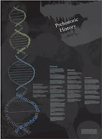
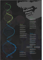
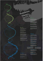
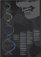
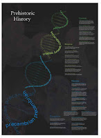
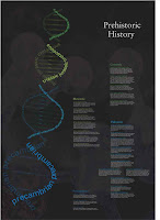
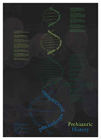
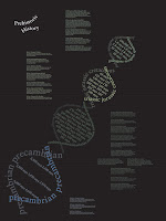
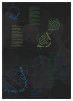
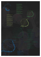
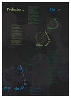
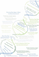
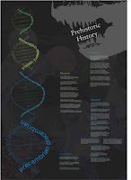
Prehistoric Timeline

Project Brief : Establishing order: Graphic design often relies on typography to commuicate order, information, and sytems. The goal of this project is to make things easy to read, navigate and understand. As you learned in typography one, the foundation for creating an clear informational structure is a a strong typographic hiearchy. Type size, wieght, and color are the the first steps. Graphic elements (lines, arrows, grids) and page structure are often used to aid in establishing a clear hierarchy.

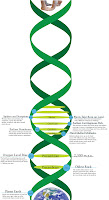
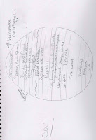
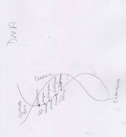
Project Overview: This project really challenged us to organize information chronologically and just plain logically. I had issues with this because I was working with 4 billion years. I chose to do a DNA time line because secretly Prehistoric History is about evolution...shhh...we're in Kansas. The project went very quick, and when we turned them in it felt like everyone just had their own mini project because we never did class critics.
Final


Round 3

Round 2


Round 1
sketch rounds


Wednesday, March 3, 2010

30 (5) Design Conversations

Chip Kidd - “getting recognition means you get to drink higher quality alcohol”.
More graphic designers need to get the credit they deserve for the work that they've done.

Linda Tischler – Design of Central Park by Frederick Law Olmsted. Harmony due to the design of all the people who use the park.
What problem should design solve next – Subprime mortgage crisis...supersize houses. Landscape of housing that doesn't serve our needs. Future design? Smaller houses with exquisite design. Green design. Community design.

Erik Spiekermann – Design – invention of the alphabet. Garmon typeface original. Meta and Meta Serif by Spiekermann. Designer thrives on constraints. Artists are allowed to go anywhere. They do not work for others. HAHA oh the last thing he says...go watch.

Brian Deputy – Design transcends with a chair. Mold plywood to the shape of the body. Aluminum is cast. Leather is a covering. Form and function are melded beautifully.
Problem – Design doesn't solve problems, people do. Design motivates and causes people to act. If the design works than any problem is solved.

Nathan Shedroff – Design – Nutrition Facts label. Clear and easy to use. Amount and type of information to the public for the first time. Impacts people's lives everyday. It may seem utilitarianism because it has zero ornamentation. It does, however, allow people to change their diet by letting them see what they are going to put into their bodies.
Problem – Shape new economics indicators. Create an economy that reflects our values. Source of destruction is great for the country... Designers create models and create possible solutions. Designers should help business people come to better models that will help make policies that lead to a better life.

As for me? An example of good design is probably the qwerty keyboard. Have you ever thought about how much time went into deciding where to place the letters? Or how far about they needed to be? Or the person who decided keeping your fingers based on the "home" keys? Just a very smart design.

A problem design can solve...cell phone GUIs. They have gotten better at it, but come one...there are still a lot of problems. I think they need to stop relying on the programmers and get some great designers in there. Yea the iphone is probably the closest to being good...but it still needs work. The organization of web information on a phone is ridiculous. We should get the whole internet with out sacrficing legibility. Sweet you can zoom in...it zooms out every refresh. Plus if you zoom in, you lose the whole picture of the site. I think somehow this can be resolved.

Tuesday, March 2, 2010

TED

The one thing that really stuck out to me in Sagmeister's speech was his list of little moments that made him happy. I almost paused the video to read all of them. Some of them were just so ordinary it was surprising they made the list, such as "hugging blah blah at the door". When he said that more than half had something to do with design, I was surprised. It made me wonder if half of my happy moments have to do with design. One, they shouldn't be because I have only been alive for 20 years and I have only been doing design for 3 years? That's be sad if my happiness came from 3 years. Second, I don't want to count how much design has made me happy. School is tough and kicks butt, so there is some time to enjoy the design, but mostly I want to make shit look good.

I watched a video on the Pentatonic Scale. It's a universal scale of music that ties directly into our spoken language and brain. Anyone in the world would know this scale and be able to perform it. The speaker demonstrated it by hopping around on stage using different points as different notes. The audience then sang a song following his jumping around.

The second video I watched was by Elizabeth Gilbert on nurturing genius. I don't know that I agree with her that creativity is from an external, almost ghost-like, source, but I know that we are interdependent of all things in the world. Without anything we couldn't create. We would have no memories, backgrounds, images, sources.

Sadly for Sagmeister's article, the pictures just would not load!!! I have no references to see what he thought was good and bad. I did read all that he wrote and I was interested in the part about what roles critics have in the world of design. The brick idea for food seemed intelligent and logical until he actually researched by bulk food and local resources made more sense than small packages and wasteful packaging.