Debbie Millman is the President of the design division at Sterling Brands, an international design consultancy. She has been there for fourteen years and in that time she has worked on the redesign of global brands for Pepsi, Procter & Gamble, Campbell’s, Colgate, Hershey and Hasbro. Debbie is President of the AIGA, the professional association for design. She is a contributing editor at Print Magazine and the chair of the new Masters in Branding program at the School of Visual Arts. In 2005, she began hosting “Design Matters with Debbie Millman,” the first weekly radio talk show about design on the Internet.
Design Matters is a weekly radio show where Debbie starts out usually with a story of her own life or experiences and ties it into the artist she interviews.
I listened to Stefan Sagmeister. I had previously watched the TED talk about his views on happiness. His formula to take a year off every seven years seems like a really good idea. 6 years of straight work seems like a lot, but when you think about it, most people work for 50 years in a row. The habbit of taking a year off gives you time to clear your mind and develop a new appreciation for design without getting disgusted with it. 6 years of work with only 7 off still gives you mass exposure to people without them forgetting who you are.
Monday, May 3, 2010
Friday, April 30, 2010
Wednesday, April 28, 2010
Internet
So, my internet at my apartment officially sucks beyond belief. I can't even sign up with vimeo it's that terrible. Video of my after effects will be posted tomorrow when I have better internet at my house. LAME.
Melanie - out
Tuesday, April 20, 2010
Friday, April 16, 2010
Journal 10
Good is? An integrated media platform for people who want to live well and do good. We are a company and community for the people, businesses, and NGOs moving the world forward. GOOD's mission is to provide content, experiences, and utilities to serve this community.
Good seems to pull from a huge variety of sources to gather...well...what's good out there. There are articles, videos, animations, clips, sound bites, speeches, games, and other things that can all lead up to what good is.
This is like a moving infographic...I like it. Your Daily Water Use The graphics are a bit too simplistic, but it really does get its point across. I like the smiley Earth at the end. The music also fits really well.
Inventions: Sleep Running This is all about will power and time to exercise. I get annoyed with his voice over, but the cuts and the transitions in the animation part is really nice. The art style also is pretty sweet
Sunday, April 4, 2010
HW - Speeches
I did the exercises to two speeches because I want to see if thousands of people choose JFK's inaugural speech before I decide on that one.
JFK Inaugural
JFK Inaugural Address
1. Who is speaking?
a. John F. Kennedy
2. Why was/is the speech important?
a. During a time of racial tension and there was a need for an increase of civil rights. War was looming and soviet aggression was spreading.
3. Why do you feel in is important or interesting?
a. The speech focuses on freedom. This is what America feels is its greatest calling is to spread and keep people and countries free. Even now, we fight for our rights and liberties. People always demand things of the government, but never think about the actions they can take to better their own situation. This is definitely an issue in America today with health care, Iraq, obesity, and welfare.
4. What is the emotion, mood, tone, personality, feeling of the speech?
a. Emotion: hopeful with caution built in
b. Mood: inspirational
c. Tone: forceful
d. Personality: Serious and in askance
e. Feeling of the speech: Powerful, gets people to react and move
5. What is intonation, emphasis, what is loud, stressed, or soft? Where are the pauses?
a.
6. What do you FEEL should be loud or soft, long pause or rushed?
7. Is there a call to action?
a. To get people involved in the country. Everyone should take a stand, not just the government
8. When listening to it, what are key/emphasized words?
a.
9. How does it make you feel?
a. Stirred to action. Ready for change. Hopeful that my actions can make a difference
10. How do you image the audience felt?
a. Very uplifting, gave confidence that he was the right man for the presidency (from daddy) Proud to be an American
11. Could there be another interpretation of the speech?
a. Foreign leaders might have felt this was a warning, especially communist leaders.
12. Write/find a short bio, of the person giving the speech:
On November 22, 1963, when he was hardly past his first thousand days in office, John Fitzgerald Kennedy was killed by an assassin's bullets as his motorcade wound through Dallas, Texas. Kennedy was the youngest man elected President; he was the youngest to die.
Of Irish descent, he was born in Brookline, Massachusetts, on May 29, 1917. Graduating from Harvard in 1940, he entered the Navy. In 1943, when his PT boat was rammed and sunk by a Japanese destroyer, Kennedy, despite grave injuries, led the survivors through perilous waters to safety.
Back from the war, he became a Democratic Congressman from the Boston area, advancing in 1953 to the Senate. He married Jacqueline Bouvier on September 12, 1953. In 1955, while recuperating from a back operation, he wrote Profiles in Courage, which won the Pulitzer Prize in history.
In 1956 Kennedy almost gained the Democratic nomination for Vice President, and four years later was a first-ballot nominee for President. Millions watched his television debates with the Republican candidate, Richard M. Nixon. Winning by a narrow margin in the popular vote, Kennedy became the first Roman Catholic President.
His Inaugural Address offered the memorable injunction: "Ask not what your country can do for you--ask what you can do for your country." As President, he set out to redeem his campaign pledge to get America moving again. His economic programs launched the country on its longest sustained expansion since World War II; before his death, he laid plans for a massive assault on persisting pockets of privation and poverty.
Responding to ever more urgent demands, he took vigorous action in the cause of equal rights, calling for new civil rights legislation. His vision of America extended to the quality of the national culture and the central role of the arts in a vital society.
He wished America to resume its old mission as the first nation dedicated to the revolution of human rights. With the Alliance for Progress and the Peace Corps, he brought American idealism to the aid of developing nations. But the hard reality of the Communist challenge remained.
Shortly after his inauguration, Kennedy permitted a band of Cuban exiles, already armed and trained, to invade their homeland. The attempt to overthrow the regime of Fidel Castro was a failure. Soon thereafter, the Soviet Union renewed its campaign against West Berlin. Kennedy replied by reinforcing the Berlin garrison and increasing the Nation's military strength, including new efforts in outer space. Confronted by this reaction, Moscow, after the erection of the Berlin Wall, relaxed its pressure in central Europe.
Instead, the Russians now sought to install nuclear missiles in Cuba. When this was discovered by air reconnaissance in October 1962, Kennedy imposed a quarantine on all offensive weapons bound for Cuba. While the world trembled on the brink of nuclear war, the Russians backed down and agreed to take the missiles away. The American response to the Cuban crisis evidently persuaded Moscow of the futility of nuclear blackmail.
Kennedy now contended that both sides had a vital interest in stopping the spread of nuclear weapons and slowing the arms race--a contention which led to the test ban treaty of 1963. The months after the Cuban crisis showed significant progress toward his goal of "a world of law and free choice, banishing the world of war and coercion." His administration thus saw the beginning of new hope for both the equal rights of Americans and the peace of the world.
Address on Vietnam War - Spiro Agnew
Address on Vietnam (4-09) – Spiro Agnew
1. Who is speaking?
a. Spiro Agnew
2. Why was/is the speech important?
a. There were many riots going on about the Vietnam War. He was addressing the ignorance of the youth involved in these acts hoping to stop their rioting
3. Why do you feel in is important or interesting?
a. I like this speech a lot because it makes me think about my generation and the music that has been inflamed by Bush’s acts in Iraq. Everyone took the “anti-government” side without really considering why America did what they did. They didn’t try to change things by listening to both sides or helping volunteer. Bands just made more music about how crappy American government was (Green Day’s American Idiot) and their followers just jumped on the band wagon. Now we are more conscious about supporting the soldiers, but the feeling is the same; senseless war and senseless death
4. What is the emotion, mood, tone, personality, feeling of the speech?
a. Emotion: Outraged by the stupidity in our country
b. Mood: Scornful
c. Tone: Scolding
d. Personality: Intelligent and thought out, but more as an upset adult yelling at stupid kids
e. Feeling of the speech: Makes you feel like an idiot
5. What is intonation, emphasis, what is loud, stressed, or soft? Where are the pauses?
a.
6. What do you FEEL should be loud or soft, long pause or rushed?
a.
7. Is there a call to action?
a. To get the youth more interested in knowing the facts and stop just following others and making trouble
8. When listening to it, what are key/emphasized words?
a.
9. How does it make you feel?
a. It makes me want to make an effort in learning about which government topics I feel strongly about. It makes me want to think through decisions instead of acting rash.
10. How do you image the audience felt?
a. Defensive. They believed what they were doing was right.
11. Could there be another interpretation of the speech?
a. People who were not involved in the war really didn’t think anything about Agnew’s address. Also, he was the VP…who remembers the VP’s speeches? My parents don’t
Write/find a short bio, of the person giving the speech:
(b. Baltimore, 9 Nov. 1918; d. 17 Sept. 1996) US; Vice-President, 1968 – 73 Agnew was a new "ethnic" American, born the son of a Greek immigrant father. He dropped out of Johns Hopkins University and then studied law in his spare time. After war service he became a lawyer and entered Baltimore politics. He rose rapidly and was elected Republican Governor for Maryland in 1966. At this time he was a relatively liberal figure in the party. He achieved national prominence for his tough law and order stand in handling the riots in Baltimore which followed the killing of Martin Luther King. In his bid for the presidency in 1968 the Republican Richard Nixon selected Agnew to be his running mate. Agnew was a compromise figure, acceptable to conservatives in the south and the border states, as well as to the liberals. Nixon was also aware of private polls which indicated that all leading candidates would on balance hurt his election chances, but Agnew would not. As Vice-President, Agnew carried the attacks to Nixon's critics over the Vietnam War and his speech writers gifted him many colourful phrases. He claimed to speak for the "silent majority" and attacked the media as "nattering nabobs of negativism". These abrasive speeches pleased the right wing and articulated some concerns over the role of the media. Not long after he and Nixon were re-elected in 1972 Agnew was accused of taking bribes, or kick-backs, from contractors in Maryland. He denied the charges but in court did not contest the charges of evading federal income tax and he resigned in disgrace. Only one other Vice-President, J. C. Calhoun in the nineteenth century, had resigned, and that was because of political differences with the President.
Tuesday, March 30, 2010
Journal 9
Motion Videos:
Saul Bass Motion
Without Sound - The movements flow with regard to gravity. I feel like they have good start up and stopping speed that you would see with gravity and external forces. I really payed attention to the way the motion moves rather than timing with sound. It helps see the fluidity of the objects.
With Sound - With sound you get an entirely different feel. The big brass band playing really made me feel like I was watching an older tv show. The sequences seemed more like watching I Dream of Jeanne. The hand took on the appeal of Thing in the Adams Family.
Six Youtube Videos
W/O sound - The movements of the type seem jerky at times. Also, the legibility wasn't that fantastic, but I don't think it was about the words, it was about what the words did. The word "vibe" shook giving the feeling of vibrate. I think the city had the words "Bustle" moving up and down. The movements of the type gave you a sense of what the word itself describes. The images and graphics usually just popped onto the screen and the type grew from them. Sometimes it work, but others it seemed awkward. It was good from the body, but not so much the record.
With sound - The sound gives it a metro city feel. The droplet fits well with the beat, but the "Let's take a hit" doesn't fit with the type on the screen. I honestly liked it without music better. I liked determining my own feel of the motion. The music just decides it for you. The color is mostly black, but when the trumpet gets more upbeat, more colors are thrown in. These go with the music's feel. Yellows, blues, and reds. Transitions are mostly following a line of type until it can begin a new sequence of type.
W/O Sound - I can easily read the speech with just the type and I know what's going on. It is also easy to tell which words Dane Cook is yelling about because the color gets more vibrant and the text gets HUGE. The words also take the form of what he his talking about. Driveway turns into a driveway and so forth
With sound - The laughs actually go with how many laughs start with. I love the fading of the text. The timing is so great on this and the way the type layers is spectacular. The colors are mostly yellow and white with pink for laughter. It really is just for contrast instead of emphasis. The transitions come with laughter and disappearing of the text. The text never really leads you to a new section of the speech.
W/O sound - the first thing I noticed was the speed. It was all pretty fast and hard to see emphasis due to stopped or slow words. I could barely read some of it. The way the type transformed or lead into other type was nicely done. I liked the background and the yellow, blue, and gray. These changed the color of the background to vary the video up a bit.
With Sound - Woah there is a creepy low voice guy reading this. The speed of the type really doesn't match his cadence of the voice. He seems to have a slow drawl and the type was flying by with undue emphasis.
W/O sound - the type starts out huge!!! and pretty much stays huge. The big words are hard to read because the type was sped up to fit it all. It was very blurry. The fight between the two characters was noticeable by type color, actually words, and location of how they flew to the back and edges of the screen
With Sound - So, the who big words thing...they aren't shouting until about the middle of the video. Also, grammar...it's wabbit season...not its wabbit season. Dumb. The only part of the speech that really is neat is the fight and how the fire explodes at the end. I do not care for this one that much.
W/O sound - The movements of the type were kind of like frame by frame cinematography. It was very jerky, but I will have to wait for the sound to see if that fits in with the sound. It was really hard to tell what I was supposed to read first because the later type never really faded out for a bit so type just kept piling on without clear hierarchy. Transitions are just white flashes on the screen, but it works with the choppy way the type moves.
With Sound - I never expected a country song. The choppy motion of the words doesn't go with the fluidity of the singer's voice. It is actually really distracting. The chorus is pretty sweet. The typography is formed well and looks fantastic. I would make the type slide like in the Saul Bass Motion piece. His was fluid and ran with a speaker. It wasn't halting.
6. Flight of the Conchords - If You're Into It - Type in Motion
Without sound - what makes this video the most unique is that it starts off like a real book. The pages turn and the words fly off the page to make a blank slate for the next page. Sometimes the words were replaced by graphics, and the type created really neat looking layouts and combinations. The words also multiplied even if the speaker doesn't repeat them thousands of times it helps the viewer understand the meaning behind his words.
With Sound - Guitar! and birds? The placement of the words really fits with when the speaker pauses and his fluidity. The type also changes for which singer is singing. The nice soft singer is a thin, serif font. The deeper voice is all caps, bold, sans serif. The closing of the book really goes with the end of the music. I think this is my favorite because the type does more than just write what the singer says, it also gives character to each voice and connotations.
3 Movie Title Sequences
1. Catch Me If You Can
Fantastic. I have always enjoyed this title sequence. The graphics, lines, and colors all perfectly represent the time and feeling of the film. It gives you a sense of drama. The cat and mouse game that takes place during the movie is well thought out in the title. The characters conflicting attitudes and roles is also evident. Scale changes in the beginning show how the main characters are equally above the "normal" people. Then, near the end they become smaller and about the same size. They are taken down a notch in society and more even with each other.
2. Panic Room
They were the first (really) to put type into a city scape and make it look like it was just part of the environment...then of course Heroes did it several years later. It has become popular in other movies also, but Panic Room really makes it legible without making you read everything head on. The type also sometimes is like a hide-and-seek game. The music also sets the scene for showing the danger of what's about to come. The metallic sheen of the letters could also relate to the metal room the main characters will spend most of their time in. The city is shown as a busy place which contrasts with the isolation the characters feel when intruders enter their home.
3. Spiderman 2
I love the comic book effect on all of the marvel comic movies. Spiderman 2 really outdid them due to the lighting, music, and spectacular typography. The text flies, breaks apart, scatters. The graphics are all enhanced with lighting. The photography all has a nice comic book effect and gives you a recap of the first movie. It's like the audience gets to see the graphic novel prequel of the movie they are about to view. It engages the viewer, but it does take away from the words when the pictures are also there. I barely read them.
Monday, March 29, 2010
Journal 8
So I definitely posted this before class, but I posted it to the class blog. So, I took it off there and am now posting it on here.
A better alternative to futura would probably be Frutiger. It is a clean typeface with the same modern feel as futura but without the overuse. It's legibility is also higher do to the large x-height.
I chose this article because of the title. Yes graphic design has made me cry. When I first related this to myself, I mostly though of crying because of frustration that is so inevitably created by the high demand and workload of being a regular college student. Then, after reading the article, I actually thought about the author's point. Beautiful design that has a powerful meaning and impact. I think, for me, movie posters are really the only type of graphic design that moves me. Some times book covers can move me or create feeling. I have been shocked by billboards and ads, but I have never been moved to cry.
I think someone could potentially design something that would affect me so deeply that I cry, but as of yet...I have not found it.
Saturday, March 20, 2010
Get Inspired
I have been having a rough time getting inspired. These posters for graphics are getting me down in the type area. I love handmade typography, but I never really understood how to make anything...especially something consistent.
I have been looking at type driven posters to get better ideas. This site has both hand made and standard typefaces. I struggle with space and hierarchy, so looking at these types of things really helps.
Tuesday, March 9, 2010
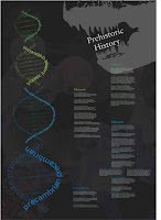
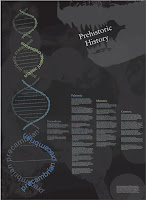
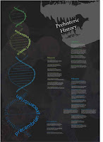
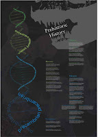
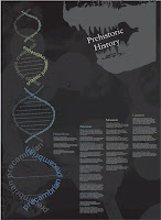
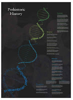
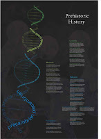
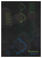
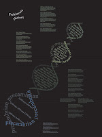
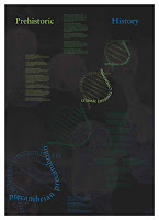
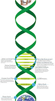
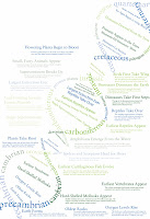
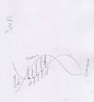
Prehistoric Timeline
Project Brief : Establishing order: Graphic design often relies on typography to commuicate order, information, and sytems. The goal of this project is to make things easy to read, navigate and understand. As you learned in typography one, the foundation for creating an clear informational structure is a a strong typographic hiearchy. Type size, wieght, and color are the the first steps. Graphic elements (lines, arrows, grids) and page structure are often used to aid in establishing a clear hierarchy.
Project Overview: This project really challenged us to organize information chronologically and just plain logically. I had issues with this because I was working with 4 billion years. I chose to do a DNA time line because secretly Prehistoric History is about evolution...shhh...we're in Kansas. The project went very quick, and when we turned them in it felt like everyone just had their own mini project because we never did class critics.
 Final
Final

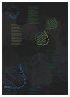
 Round 3
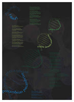
 Round 2
 Round 1

 sketch rounds
Project Overview: This project really challenged us to organize information chronologically and just plain logically. I had issues with this because I was working with 4 billion years. I chose to do a DNA time line because secretly Prehistoric History is about evolution...shhh...we're in Kansas. The project went very quick, and when we turned them in it felt like everyone just had their own mini project because we never did class critics.
 Final
Final


 Round 3
 Round 2


 Round 1

 sketch rounds
Wednesday, March 3, 2010
30 (5) Design Conversations
Chip Kidd - “getting recognition means you get to drink higher quality alcohol”.
More graphic designers need to get the credit they deserve for the work that they've done.
Linda Tischler – Design of Central Park by Frederick Law Olmsted. Harmony due to the design of all the people who use the park.
What problem should design solve next – Subprime mortgage crisis...supersize houses. Landscape of housing that doesn't serve our needs. Future design? Smaller houses with exquisite design. Green design. Community design.
Erik Spiekermann – Design – invention of the alphabet. Garmon typeface original. Meta and Meta Serif by Spiekermann. Designer thrives on constraints. Artists are allowed to go anywhere. They do not work for others. HAHA oh the last thing he says...go watch.
Brian Deputy – Design transcends with a chair. Mold plywood to the shape of the body. Aluminum is cast. Leather is a covering. Form and function are melded beautifully.
Problem – Design doesn't solve problems, people do. Design motivates and causes people to act. If the design works than any problem is solved.
Nathan Shedroff – Design – Nutrition Facts label. Clear and easy to use. Amount and type of information to the public for the first time. Impacts people's lives everyday. It may seem utilitarianism because it has zero ornamentation. It does, however, allow people to change their diet by letting them see what they are going to put into their bodies.
Problem – Shape new economics indicators. Create an economy that reflects our values. Source of destruction is great for the country... Designers create models and create possible solutions. Designers should help business people come to better models that will help make policies that lead to a better life.
As for me? An example of good design is probably the qwerty keyboard. Have you ever thought about how much time went into deciding where to place the letters? Or how far about they needed to be? Or the person who decided keeping your fingers based on the "home" keys? Just a very smart design.
A problem design can solve...cell phone GUIs. They have gotten better at it, but come one...there are still a lot of problems. I think they need to stop relying on the programmers and get some great designers in there. Yea the iphone is probably the closest to being good...but it still needs work. The organization of web information on a phone is ridiculous. We should get the whole internet with out sacrficing legibility. Sweet you can zoom in...it zooms out every refresh. Plus if you zoom in, you lose the whole picture of the site. I think somehow this can be resolved.
Tuesday, March 2, 2010
TED
The one thing that really stuck out to me in Sagmeister's speech was his list of little moments that made him happy. I almost paused the video to read all of them. Some of them were just so ordinary it was surprising they made the list, such as "hugging blah blah at the door". When he said that more than half had something to do with design, I was surprised. It made me wonder if half of my happy moments have to do with design. One, they shouldn't be because I have only been alive for 20 years and I have only been doing design for 3 years? That's be sad if my happiness came from 3 years. Second, I don't want to count how much design has made me happy. School is tough and kicks butt, so there is some time to enjoy the design, but mostly I want to make shit look good.
I watched a video on the Pentatonic Scale. It's a universal scale of music that ties directly into our spoken language and brain. Anyone in the world would know this scale and be able to perform it. The speaker demonstrated it by hopping around on stage using different points as different notes. The audience then sang a song following his jumping around.
The second video I watched was by Elizabeth Gilbert on nurturing genius. I don't know that I agree with her that creativity is from an external, almost ghost-like, source, but I know that we are interdependent of all things in the world. Without anything we couldn't create. We would have no memories, backgrounds, images, sources.
Sadly for Sagmeister's article, the pictures just would not load!!! I have no references to see what he thought was good and bad. I did read all that he wrote and I was interested in the part about what roles critics have in the world of design. The brick idea for food seemed intelligent and logical until he actually researched by bulk food and local resources made more sense than small packages and wasteful packaging.
Saturday, February 20, 2010
Final Book Covers


Concept Statement Revised:
Transformed Hope
Transform - to change in form, appearance, or structure; metamorphose.
to change in condition, nature, or character; convert.
to change in condition, nature, or character; convert.
-- alter, metamorphose, renew, mold, change, switch, transfer, overcome, prevail, sway
Hope - the feelings that what is wanted can be had or that events will turn out for the best, a particular instance of this feelings; a person or a thing in which expectations are centered: The medicine was her last hope
-- desire, believe, trust, anticipation, aspiration, faith, goal, gain, security, stock, life, wish, optimism, prospect, promise
To Suggest:
to suggest that love is complex
to suggest that hope can survive in even the most dire of situations
to suggest that the weak can become strong
to suggest that life can be intense
to suggest that fear can be conquered
to suggest that secrets are kept 'til the end
to suggest that hope can survive in even the most dire of situations
to suggest that the weak can become strong
to suggest that life can be intense
to suggest that fear can be conquered
to suggest that secrets are kept 'til the end
Bruce Mau
He is the Chief Creative Editor of Bruce Mau Design. He founded the studio in 1985. He also founded a studio-based postgraduate program that helps refocus and teach for the future of design. He designed the Zone Books. They were covers for a complex combination of critical thinking about urbanism by philosophers. The books also featured graphic elements that gave the tone for the books. His method of creating the cover was really about modeling a city and creating a map.
38. Explore the other edge.
Great liberty exists when we avoid trying to run with the technological pack. We can’t find the leading edge because it’s trampled underfoot. Try using old-tech equipment made obsolete by an economic cycle but still rich with potential.
Great liberty exists when we avoid trying to run with the technological pack. We can’t find the leading edge because it’s trampled underfoot. Try using old-tech equipment made obsolete by an economic cycle but still rich with potential.
I chose this because I feel sometimes that I am too limited by the computer or technology I am comfortable with. I would like to branch out and try new things and different ways of doing them.
Monday, February 15, 2010
Gathering Ideas
Photography and type has always given me issues. I like them separate but when combined, I feel one makes the other look unnecessary. I found this sweet website while looking for great book cover designs. It has everything from vector to photography to type only. They are beautiful.
Sunday, February 14, 2010
20 Rules
This PDF included 20 rules on what consists of great design and how to create great design. It included everything from type to images, to measuring with your eyes.
3 Most Important:
Be Decisive - Everything in the design should be placed there for a reason. If it is just random or an afterthought, the cohesiveness of the design could break down.
Pick Colors on Purpose - Colors have meaning tied to them, they evoke certain emotions or conjure up certain images. A great color scheme can relate a certain message even before the design registers in the viewer's mind.
1,2 Punch - This has to do with hierarchy and moving the eye throughout the design. If there is no movement, there is static. Boring.
3 Things I need to Practice:
Negative Space - I always try to fill the space and don't leave much balance with negative space. I am even having this issue with my book covers. I find it hard to create white space with images without seeming to frame the objects within the piece. I need to practice the flow of negative to positive space.
Type as Image - Regular schooling teaches you that type is informative and nothing more. Now, we are taught that it has form, space, and meaning. I need to practice really using my type as a dynamic design object in my art.
One Visual Voice - I am ok at this in one piece, but when I design a series I find this is really hard to do without making everything look the exact same.
3 Things I ignore
Be Universal - There are times when I will design something that I think everyone and their mom should understand, but many times designers are designing for a certain demographic. As long as you know they will get it, then I think you are fine. Trying too hard to get everyone to understand will muddle the message or make it too simple.
Create Images, Don't Scavenge - Maybe when I am out of school I will try to follow this more closely, but the heavy amount of hw and work we are expected to do leaves us little choice in where we can get our images. If the internet works, use it.
Type is Only Type When Friendly - Legibility is important, but sometimes type can be used as texture or image. This is when actual legibility might take away the purpose of the type.
Saturday, February 6, 2010
Chip Kidd & John Gall
Chip Kidd
Born in Reading, Pennsylvania, Kidd grew up in the Reading suburb of Shillington, strongly influenced by American popular culture.Kidd is currently associate art director at Knopf, an imprint of Random House. He first joined the Knopf design team in 1986, when he was hired as a junior assistant. Turning out jacket designs at an average of 75 a year. Publishers Weekly described his book jackets as "creepy, striking, sly, smart, unpredictable covers that make readers appreciate books as objects of art as well as literature." USA Today also called him "the closest thing to a rock star" in graphic design today, while author James Ellroy has called him “the world’s greatest book-jacket designer.His book jacket designs for Alfred A. Knopf (where he is associate art director) have helped spawn a revolution in the art of American book packaging. His work has been featured inVanity Fair, Eye, Print, Entertainment Weekly, The New Republic, Time, Graphis, New York, andID magazines, and he is a regular contributor of visual commentary to the Op-Ed page of The New York Times.John Gall
Born in 1963 in New Jersey and a graduate of the design department at Rutgers University, Gall brought along his own original and idiosyncratic design sense—and most especially literary intelligence. Recently, in addition to Vintage, Gall assumed the helm of another venerable imprint, Anchor Books, the oldest trade paperback publisher in America, founded in 1953 by Jason Epstein.Gall’s stylish sensibility, simple but elegant use of typography and quietly rebellious spirit infuse these literary works with an added dimension. Subtle and compelling, his covers play with the perceptions of the viewer in unexpected ways, and to satisfying effect. Scanning the table of trade paperbacks at the local bookseller, one would have no difficulty spotting Gall’s distinctive and visually articulate work. Collage, photography, typography and art are all grist for the mill, yet no matter how varied the medium, the end result is pure Gall.
These two book designers really try to understand the voice of the work that they are making the cover for. They really try to capture the essence of the work. Each design is revolutionary. John Gall tries to give each of his book covers a surprise twist that somehow capture the idea of the book.
Sunday, January 31, 2010


Tuesday, January 26, 2010
Type - Audience and Concepts
Audience Persona:
Emma is a seventeen-year-old girl living at home with her parents and in her senior year of high school. She is part of National Honors Society and enjoys helping out in her community. She currently does not have a job, but she is very active with school activities.
Emma was always a reader starting at a very young age. As she has grown, so has her taste in books. She has always been fascinated by sociology and psychology. Human relationships interest her greatly. She is the vice president of an outreach program that tries to help troubled families. She feels fulfilled from her work.
Emma is already filling out applications for colleges, and she is having a hard time declaring her major. She is torn between psychology, sociology, or just getting into the field of being a social worker. She plans on getting a job near her college to help her parents pay the bills. She has applied as a receptionist to several companies. When she does have extra time on her hands, Emma is either campaigning or helping her community.
Concepts
Shattered Hope
Shattered –to break into pieces
- to damage, impair, destroy, weaken, burst, crack, crush, ruin, splinter, wreck, fragment
Hope - the feeling that what is wanted can be had or that events will turn out for the best, a particular instance of this feeling, a person or thing in which expectations are centered: The medicine was her last hope.
- desire, believe, trust, anticipation, aspiration, faith, goal, gain, security, stock, life, wish, optimism, prospect, promise
Hopeful Fear
Hopeful – full of hope, expressing hope – promising a bright future/success/advantage
- assured, at ease, buoyant, calm, cheerful, comfortable, content, confident, eager, elated, enthusiastic, light-hearted, serene, trusting
Fear - a distressing emotion aroused by impending danger, evil, pain, etc., whether the threat is real or imagined; the feeling or condition of being afraid/concern or anxiety; solicitude/a specific instance of or propensity for such a feeling
- agitation, alarm, apprehension, anxiety, aversion, concern, doubt, distress, dread, nightmare, panic, scare, suspicion, terror, trepidation, worry, uneasy, shudder, shun, flinch, fret, falter, despair
Beautiful Agony
Beautiful - having beauty; having qualities that give great pleasure or satisfaction to see, hear, think about/wonderful; very pleasing or satisfying
- attractive, fair, lovely, pretty, alluring, angelic, appealing, divine, elegant, stunning, sublime, charming, classy, radiant
Agony - extreme and generally prolonged pain; intense physical or mental suffering/the struggle preceding natural death: mortal agony/ a display or outburst of intense mental or emotional excitement
- affliction, anguish, distress, misery, torment, torture
Type - Journal 01

This information was really interesting even though I have heard of all these processes before, but it was interesting seeing how it could function in a design oriented way. I like that it was focused towards designing and not just creative thinking.
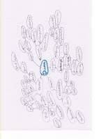
Summary: This reading just talked about different techniques to focus thoughts and energy. The MindMap is a strategy that really just has you get all your thoughts out onto a piece of paper. I thought that was really useful because I could see how and where my thoughts connected.
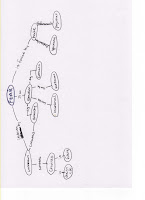
ConceptMap: I hated this. It is a good idea in theory but it takes too much work to really be connected to process work.
FreeWrite: I used to love these in high school. It really helps me figure out where I want things to lead or how to solve a problem. I might use these more for the rest of my design projects
WordList: Kind of helpful, but I think MindMaps do the same thing, but in a better way. It is easier to lose connections when all your words are just in a list.
Thursday, January 21, 2010
Phase One Research
Definitions:
 Sign – a token; indication/any object, action, event, pattern, etc., that conveys a m
 Index - something used or serving to point out; a sign, token, or indication: a true index of his character./ something that directs attention to some fact, condition, etc.; a guiding principle. (litter box is an index for a cat)
 Symbol - something used for or regarded as representing something else; a material object representing something, often something immaterial; emblem, token, or sign./ a word, phrase, image, or the like having a complex of associated meanings and perceived as having inherent value separable from that which is symbolized, as being part of that which is symbolized, and as performing its normal function of standing for or representing that which is symbolized: usually conceived as deriving its meaning chiefly from the structure in which it appears, and generally distinguished from a sign. (symbol for love)


Series - a group or a number of related or similar things, events, etc., arranged or occurring in temporal, spatial, or other order or succession; sequence/a set of successive volumes or issues of a periodical published in like form with similarity of subject or purpose.
Sequence - the following of one thing after another; succession/order of succession: a list of books in alphabetical sequence/something that follows; a subsequent event; result; consequence
Sign – a token; indication/any object, action, event, pattern, etc., that conveys a meaning/a conventional or arbitrary mark, figure, or symbol used as an abbreviation for the word or words it represents (this is a sign for electrical on and off power)
Index - something used or serving to point out; a sign, token, or indication: a true index of his character./ something that directs attention to some fact, condition, etc.; a guiding principle. (litter box is an index for a cat)Symbol - something used for or regarded as representing something else; a material object representing something, often something immaterial; emblem, token, or sign./ a word, phrase, image, or the like having a complex of associated meanings and perceived as having inherent value separable from that which is symbolized, as being part of that which is symbolized, and as performing its normal function of standing for or representing that which is symbolized: usually conceived as deriving its meaning chiefly from the structure in which it appears, and generally distinguished from a sign. (symbol for love)-------------------------------------------------------------------------------------------------
Successful Bookjackets
Knowing your target audience. Use imagery that appeals to that demographic and also is a good representation of your book.
Knowing your target audience. Use imagery that appeals to that demographic and also is a good representation of your book.
Legibility is important so the audience or potential audience understands the type used on the cover. Good contrast and effective style is helpful.
Images and image placement. The type and the image should flow together to make a cohesive design. They should not disrupt each other in an unpleasing style.
Harmony, balance, unity, synthesis, and refinement are necessary qualities the cover should have.
Designs:

-------------------------------------------------------------------------------------------------
My 3 Books
1. 2.
2. 3.
3.
 2. 3.
2. 3.1. Hand with Care
2. Change of Heart
3. Picture Perfect
2. Change of Heart
3. Picture Perfect
All three books are by Jodi Picoult and they are all dramas that have twists at the end.
Author Info:
Novelist Jodi Picoult makes her home in Hanover, New Hampshire. Picoult, who was awarded the New England Bookseller Award for fiction in 2003, has written over a dozen novels since 1992. She was born in 1966 and raised in Nesconset on Long Island, New York. Her very first story, titled "The Lobster Which Misunderstood" was written when she was only 5 years old.
Handle With Care
Things break all the time. Day breaks, waves break, voices break. Promises break. Hearts break.
Every expectant parent will tell you that they don't want a perfect baby, just a healthy one. Charlotte and Sean O'Keefe would have asked for a healthy baby, too, if they'd been given the choice. Instead, their lives are made up of sleepless nights, mounting bills, the pitying stares of "luckier" parents, and maybe worst of all, the what-ifs. What if their child had been born healthy? But it's all worth it because Willow is, well, funny as it seems, perfect. She's smart as a whip, on her way to being as pretty as her mother, kind, brave, and for a five-year-old an unexpectedly deep source of wisdom. Willow is Willow, in sickness and in health.
Everything changes, though, after a series of events forces Charlotte and her husband to confront the most serious what-ifs of all. What if Charlotte should have known earlier of Willow's illness? What if things could have been different? What if their beloved Willow had never been born? To do Willow justice, Charlotte must ask herself these questions and one more. What constitutes a valuable life?
Emotionally riveting and profoundly moving, Handle with Care brings us into the heart of a family bound by an incredible burden, a desperate will to keep their ties from breaking, and, ultimately, a powerful capacity for love. Written with the grace and wisdom she's become famous for, beloved #1 New York Times bestselling author Jodi Picoult offers us an unforgettable novel about the fragility of life and the lengths we will go to protect it.
Change of Heart
The acclaimed #1 New York Times bestselling author presents a spellbinding tale of a mother's tragic loss and one man's last chance at gaining salvation.
Can we save ourselves, or do we rely on others to do it? Is what we believe always the truth?
One moment June Nealon was happily looking forward to years full of laughter and adventure with her family, and the next, she was staring into a future that was as empty as her heart. Now her life is a waiting game. Waiting for time to heal her wounds, waiting for justice. In short, waiting for a miracle to happen.
For Shay Bourne, life holds no more surprises. The world has given him nothing, and he has nothing to offer the world. In a heartbeat, though, something happens that changes everything for him. Now, he has one last chance for salvation, and it lies with June's eleven-year-old daughter, Claire. But between Shay and Claire stretches an ocean of bitter regrets, past crimes, and the rage of a mother who has lost her child.
Would you give up your vengeance against someone you hate if it meant saving someone you love? Would you want your dreams to come true if it meant granting your enemy's dying wish?
Once again, Jodi Picoult mesmerizes and enthralls readers with this story of redemption, justice, and love.
Picture Perfect
Jodi Picoult's novels have been hailed as "engrossing" (People) and "addictively readable" (Entertainment Weekly). Now, the author of Salem Falls and Plain Truth examines the fault lines of a troubled marriage in Picture Perfect-an "unfailingly intelligent...undeniably literary psychological drama."(Booklist) "Picoult writes with an all-knowing and piercing eye. Hers is an important book from a talented writer we hope to hear from again and again." (Library Journal) To the outside world, they seem to have it all. Cassie Barrett, a renowned anthropologist, and Alex Rivers, one of Hollywood's hottest actors, met on the set of a motion picture in Africa. They shared childhood tales, toasted the future, and declared their love in a fairy-tale wedding. But when they return to California, something alters the picture of their perfect marriage. A frightening pattern is taking shape-a cycle of hurt, denial, and promises, thinly veiled by glamour. Torn between fear and something that resembles love, Cassie wrestles with questions she never dreamed she would face: How can she leave? Then again, how can she stay?
--------------------------------------------------------------------------------------------------------------------------------------------------------------------------
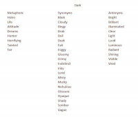
Associated Word List
secrets, mystery, drama, love, relationships, honest, lies, passion, anger, fear, emotional, many point of views, joy, religion, family, medical, enigma, problems, thriller, affection, prejudice, caring, pity, concern, compassion, humanity, fidelity, frailty, mortal, bravery, soul, purpose, fortitude, devotion, weakness, angst, panic, anxiety, doubt, distress, nightmare, revulsion, suspicion, terror, jittery, courage, depressing, dismal, glum, morbid, pensive, pessimistic, troubled, wistful, empty, intense, dark, hopeful, wretched, wishful, prayer, trust, endurance, faith, frustration, suspense
Key Words:
Love - a profoundly tender, passionate affection for another person, a feeling of warm personal attachment or deep affection, as for a parent, child, or friend
Brave - possessing or displaying courage; able to face and deal with danger or fear without flinching/courage: a quality of spirit that enables you to face danger or pain without showing fear/fearlessness: feeling no fear
Frailty - wanting in moral strength, courage, or will; having the attributes of man as opposed to e.g. divine beings
Dark - gloomy; cheerless; dismal/evil; iniquitous; wicked/hard to understand; obscure
Hopeful - bright: full or promise/the feeling that what is wanted can be had or that events will turn out for the best
Distress - great pain, anxiety, or sorrow; acute physical or mental suffering; affliction; trouble/that which causes pain, suffering, trouble, danger
Humanity - the quality or condition of being human; human nature/the quality of being humane; kindness; benevolence
Mystery - anything that is kept secret or remains unexplained or unknown/any affair, thing, or person that presents features or qualities so obscure as to arouse curiosity or speculation/obscure, puzzling, or mysterious quality or character
Suspense - a state or condition of mental uncertainty or excitement, as in awaiting a decision or outcome, usually accompanied by a degree of apprehension or anxiety
Intense - acute, strong, or vehement, as sensations, feelings, or emotions/of an extreme kind; very great, as in strength, keenness, severity, or the like
Tone:
-------------------------------------------------------------------------------------------------
To Suggest
to suggest that love is complex
to suggest that hope can survive in even the most dire of situations
to suggest that the weak can become strong
to suggest that life can be intense
to suggest that fear can be conquered
to suggest that secrets are kept 'til the end
-------------------------------------------------------------------------------------------------
Quotes:
1."Vows are spoken/To be broken/Feelings are intense/Words are trivial/Pleasures remain/So does the pain/Words are meaningless/And forgettable" Depeche Mode - Enjoy the Silence
2. "Precious and fragile things/Need special handling/My God what have we done to You?/We always try to share/The tenderest of care/Now look what we have put You through..." Depeche Mode - Precious
3. "He never knew what to say... He wished he'd learned long ago how to put into words the feeling that if she was gone, if she ever left, he would cease to exist."
4. "Once you had put the pieces back together, even though you may look intact, you were never quite the same as you'd been before the fall."
5. "Torn between fear and something that resembled love, she wrestled with questions she never dreamed she would face: How could she leave? Then again, how could she stay?"
6. "To live is like to love--all reason is against it, and all healthy instinct for it." Samuel Butler
7. "Pain and pleasure, like light and darkness, succeed each other." Laurence Sterne
8. He who treads the path of love walks a thousand meters as if it were only one.
9. "Know that although in the eternal scheme of things you are small, you are also unique and irreplaceable, as are all your fellow humans everywhere in the world."
10. "You must not lose faith in humanity. Humanity is an ocean; if a few drops of the ocean are dirty, the ocean does not become dirty."
Subscribe to:
Comments (Atom)